Classic serif font for designers, easy desktop integration
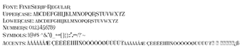
Fine Serif, developed by Fine Serif, is a serif typeface designed to give print and digital layouts a traditional typographic voice. It renders high-contrast strokes and classical proportions for readable headlines and body text, and includes a standard character set with multilingual coverage. Originally released in 2010, the design appears across personal creative projects and formal layouts. The font targets graphic designers, typographers, and hobbyists seeking formal serif options for invitations, branding, and editorial layout.
Installation and workflow integration are simple for desktop users
Installation uses a standard TrueType file that desktop font managers accept, and adding it to a system is a local operation rather than a background service. The font integrates directly into common layout and office tools, so designers open it from applications such as Adobe Creative Suite and Microsoft Office without additional plugins. That makes day-to-day use a matter of selecting the family in the application’s font menu.
Glyph set size and language support suit basic Latin work
The font includes approximately 235 glyphs, covering basic Latin characters, numerals, punctuation, and a number of accented letters for limited multilingual usage. Explicitly supported languages include English, Dutch, and Malay, which matches most personal and small-scale editorial needs. Projects needing extended scripts, extensive diacritics, or large symbol inventories may find the set restrictive.
Typographic flexibility is focused rather than expansive
The design ships in a single Regular weight, so typographic hierarchy must rely on size, tracking, or mixing with other families. For branding systems that require multiple weights or variable font features, this single-weight approach reduces internal options. Designers that plan multi-weight systems should treat the font as a characterful display or body choice, then pair it with complementary families for contrast.
Creator provenance and community uptake ease selection decisions
The face was designed by Galdino Otten and appears on major public repositories, where it has accumulated roughly 200,000 downloads. Community comments on those sites reflect frequent use in invitations and personal creative projects, which supports practical adoption. The availability across repositories means designers can test the font locally before committing it to longer-term projects.
A practical serif for personal and editorial use, with a licensing caveat
The font is a practical choice for designers and hobbyists who need a classic serif that installs and integrates easily into desktop workflows. One important consideration: commercial projects require a separate license obtained from the developer. For personal creative work and limited editorial use the font fits well; teams requiring expanded language coverage or multi-weight systems should evaluate additional options before committing.